Your Cart
Loading

Here you'll find several articles about my products and process, helpful tips, and insights into the inspiration behind my various lettering styles.

Helpful Tips

How to Uncurl Your Art Print
While it’s quite easy to ship small art prints in a flat mailer, larger prints and posters usually get shipped in a tube. This helps protect them during shipping, and makes the shipping more economical (can you imagine how costly it would be to ship...
Read More
Mounting an Art Print to a Mat
When hanging art in my home, I almost always gravitate to a matted frame. That’s because, to me, matted art just looks better. Matted frames are a great way to elevate an art print. The added space around the print gives the artwork a chance to brea...
Read More
Which Artwork Should I Choose?
A customer asked me this question at a market last year. It’s such a difficult question to answer because artwork is so personal. Most of my customers immediately gravitate to one piece or another. The hardest decisions are usually which color schem...
Read More

Product Articles

Product Spotlight: Art Prints
When I first started thinking about offering art prints, I knew I wanted a high-quality paper but wasn’t sure where to start. Most of my sales came from my Etsy store at the time (I was selling downloadable digital art then), and I was still a nomad...
Read More
What Are Giclée Art Prints?
If you’ve ever come across the word “giclée” while browsing art, you might’ve wondered what exactly that means, and why some prints cost more than others. Let’s break it down. Giclée (pronounced zhee-clay) refers to a high-quality printing method th...
Read More
Product Spotlight: Postcards
I have a bit of an obsession with postcards. I buy them all the time while traveling. We usually get a set to mail out to friends and family and another to keep for ourselves as little mementos.
Read More

Process Articles

How I Create A Custom Art Layout
With three different kinds of elements to choose from (and 22 total), each layout request is entirely unique, so each order needs to be assessed individually. Here's the general method I use when creating a new layout.
Read More
How I Use Color to Balance My Artwork
We're so used to seeing dark type on a light background. But did you know that at the same size, light type on a dark background appears larger? In this article, we'll look at how I use color to help give balance to a Custom Art Print.
Read More
Creating My Color Schemes
When I first started designing these art prints, I had very muted colors in mind. I never thought of myself as a bold colors girl. Instead, I usually gravitated toward a neutral color scheme. Each of my first four cities were initially designed in o...
Read More

Lettering Style Inspiration

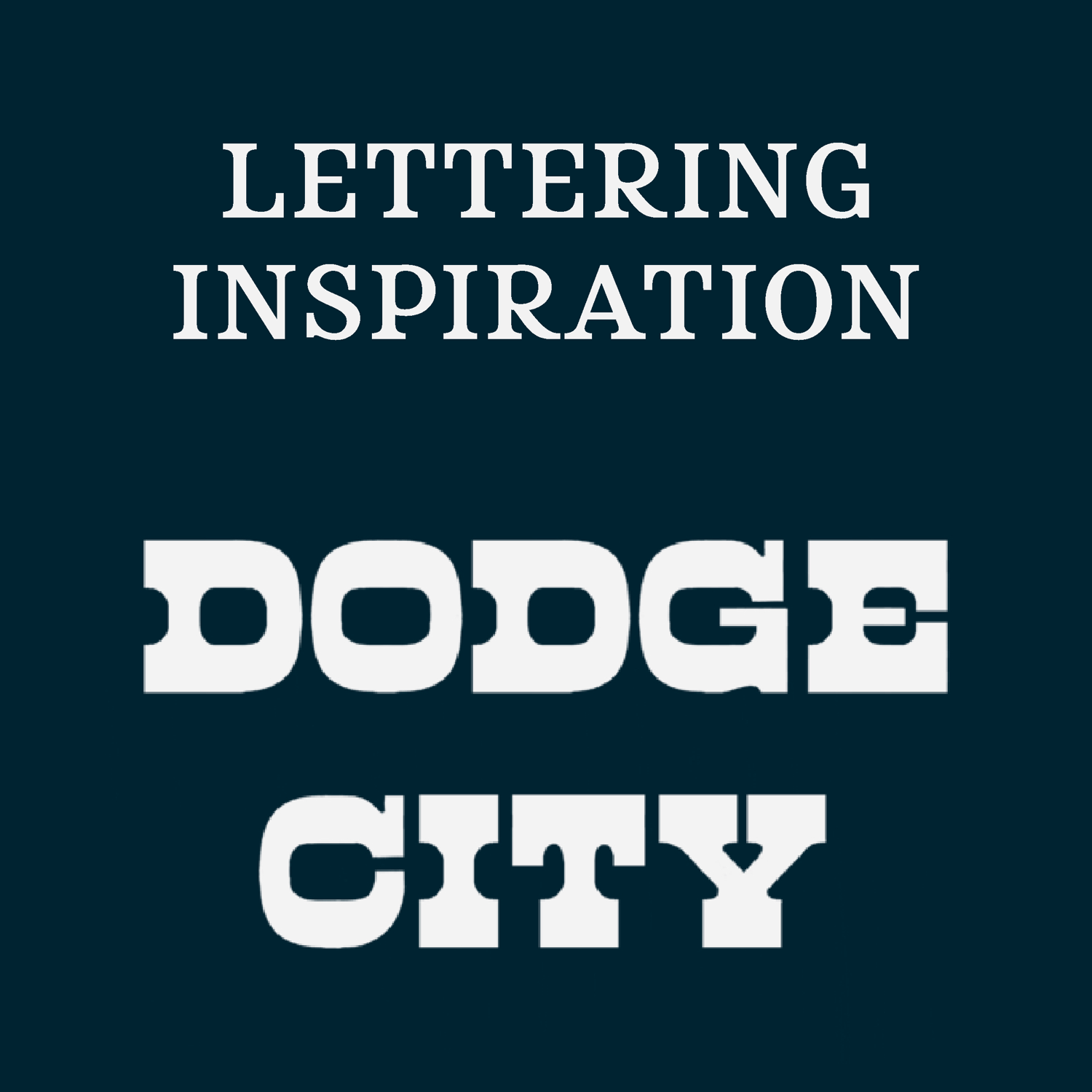
Style Inspiration: Dodge City
The Dodge City lettering style is a chunky, reverse contrast lettering style originally inspired by its namesake: Dodge City, Kansas. When I first developed the concept of my Matchbox Art Series, I was originally going to feature places where I had ...
Read More
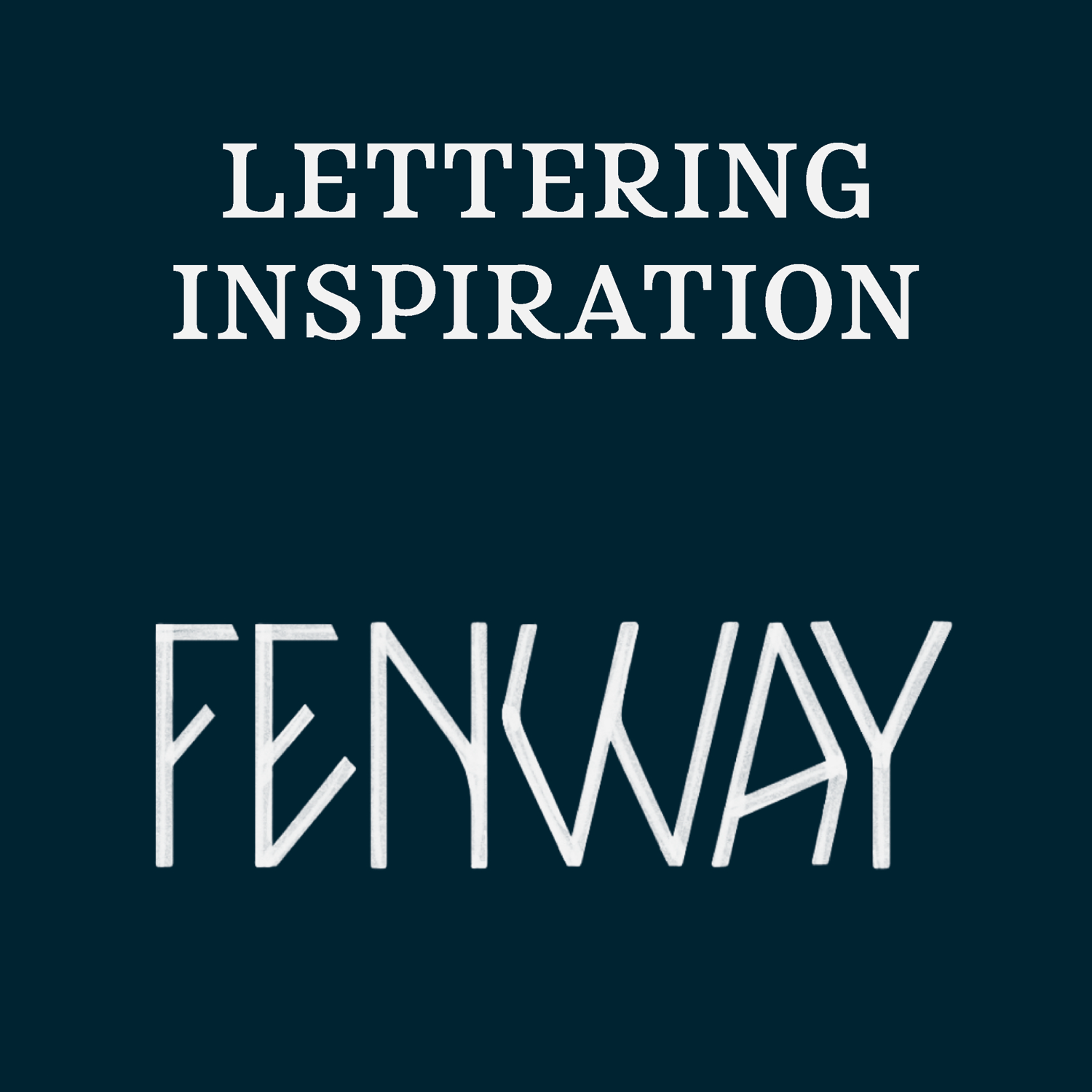
Style Inspiration: Fenway
This style was adapted from my original matchbox design, the one I created for my favorite restaurants in Charleston, SC. I was trying to think of a style for ‘Brown Dog Deli’ when I passed this sign for Duck Donuts in Charlotte, NC.
Read More
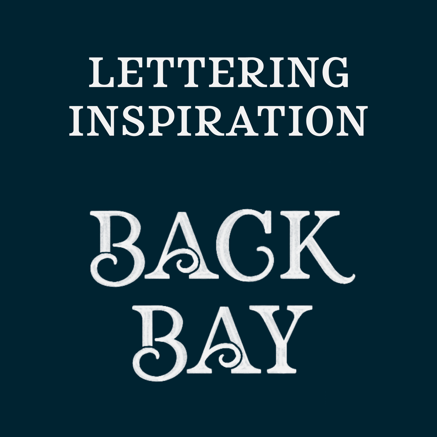
Style Inspiration: Back Bay
This style came from one of my earliest matchbox designs. I wanted an elegant serif font to convey this stately Boston neighborhood, but with a small touch of flair. I used a simple serif font as a placeholder and guide for the basic dimensions of t...
Read More
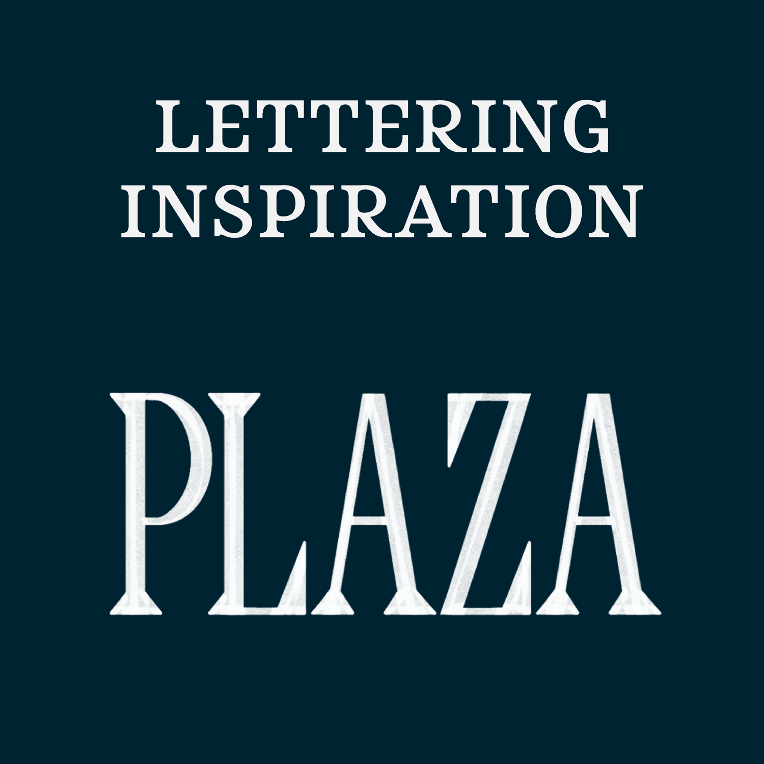
Style Inspiration: Plaza
Plaza is a modified style taken from the Los Angeles Matchbox Art Print for Los Feliz. For the 'Los Feliz' lettering, I created this very angular, almost stencil-like lettering style. It fit perfectly for that specific piece of artwork, bu...
Read More
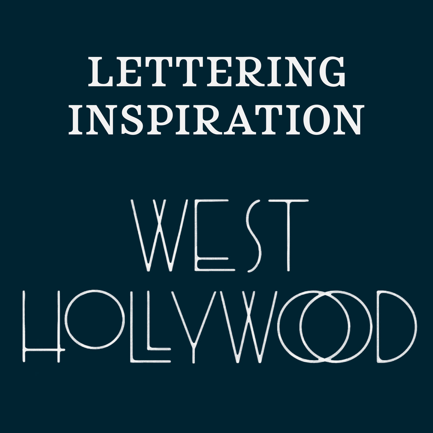
Style Inspiration: West Hollywood
When I was creating my initial matchbox art prints, I went through a bit of an art deco phase. The Charleston, SC and Los Angeles, CA prints were the first ones to be completed. Charleston had this high-contrast art deco inspired font for ‘Downtown’...
Read More
Style Inspiration: Charlestown
The Charlestown style was inspired by old-world, handwritten scripts. Before we moved to Boston full-time, we visited the Charlestown Navy Yard and Bunker Hill Museums, and I found several examples of these script styles in the museum graphics. Belo...
Read More
Style Inspiration: Santa Monica
This fun and funky, reverse contrast style was initially created while I was drawing my Los Angeles Matchbox Print. I needed a style that represented Santa Monica, but that also worked with the locations I had already created for the artwork and bal...
Read More
Style Inspiration: South End
I originally created this style while I was working on a typeface for a client. She was looking for a script/handwritten font style with an emphasis on legibility. One day while I was brainstorming for her, I started drawing what ultimately became m...
Read More
Style Inspiration: Crossroads
This style was initially created for my first matchbox art print, the one I made for some of my favorite Charleston restaurants. There was this great spot called Cru Café, which sadly closed in 2024. This restaurant merged fine dining with comfort f...
Read More
Style Inspiration: James Island
When I started creating my matchbox art prints, I used place-holder fonts for the first few designs. I went to Adobe Fonts for visual inspiration to help me narrow down some styles that I thought represented the neighborhoods I had chosen for my art...
Read More